Evolution of the Brand Logos of Famous Automobile Manufacturers
As we all know, every company has its brand logo but it never came in our mind that what is the actual mean by that particular logo. The brand logo is not just a visual image or a show piece of the company, but it has an interesting story behind this. We always see 4 combined circles on the bonnet of Audi cars, 3 pointed star at Mercedes-Benz cars and other logos of popular automakers, but never thought that what they indicates or why they are in that shape. Here, we’re updating evolution of the brand logos of famous automakers along with their story.
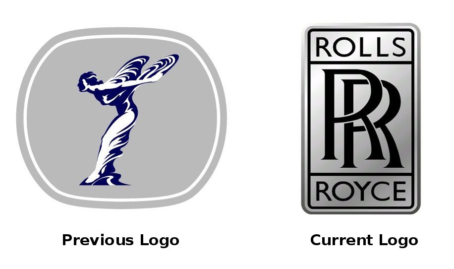
Rolls-Royce
The name of the company comes by the surnames of founders, Charles Rolls and Henry Royce. At the start, Rolls-Royce had the logo of a flying lady which indicates the love of the Lord John Walter to the queen Cecil Victoria Constance. As time passed, the logo is improved and now, it is designed as combined “RR” with the name of the company.
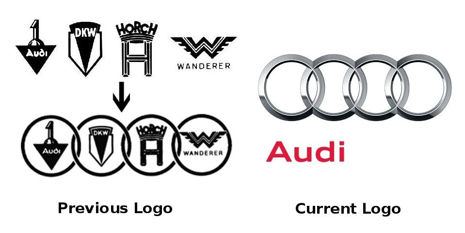
Audi
The company was founded in 1899 by a German engineer, August Horch. In 1932, the Audi became Audi Union by merging 4 manufacturers (Audi, Horch, Wanderer and DKW) and as time passed, it is known as Audi company and the badge converted into 4 combined overlapped circles with “Audi” at the bottom center. This logo was redesigned and garnished with chrome finish and the word “Audi” also shifted to the left of the bottom along with changes in the fonts as well.
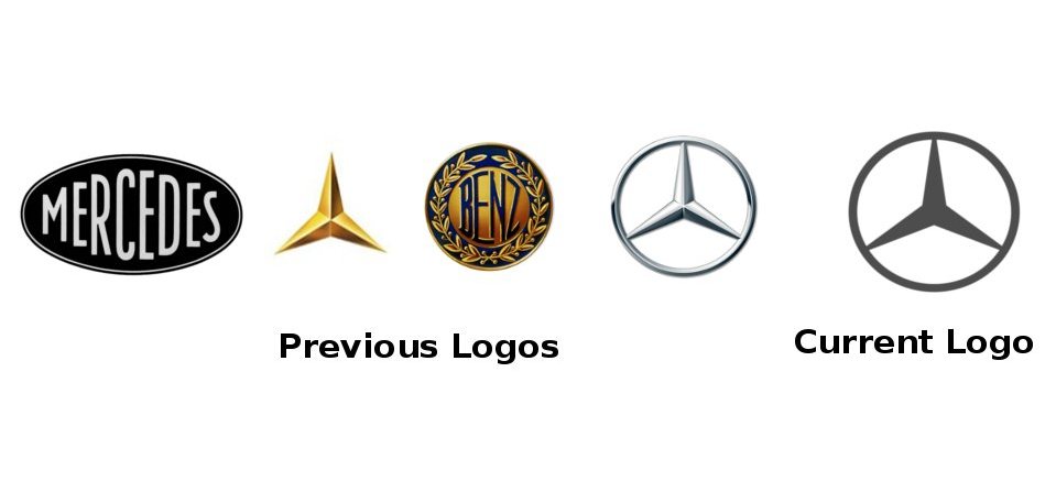
Mercedes-Benz
At first, Mercedes-Benz had only its name in the brand logo, which was converted in the year 1909 into 3 pointed star with a golden shine. Later, the new logo designed with pictures and now, the company includes laurel wreath of Benz and the 3 pointed star of Mercedes with its bold look in its logo.
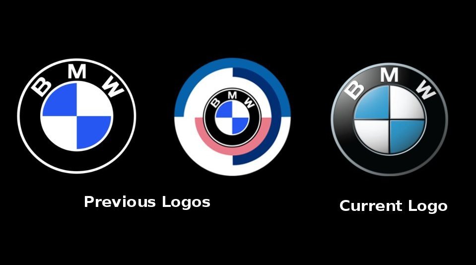
BMW
BMW logo included with the color of the sky as it was founded as an aircraft company. There isn’t any big change in the previous and current badge, but the current logo has been finished with stylish looks and boldness.
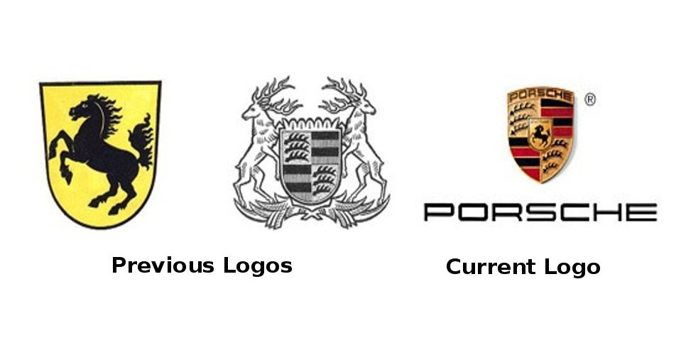
Porsche
The German luxury automaker manufactures powerful cars with elegant features. Initially, it had a dynamic image of knight indicating the power of its cars which was redesigned later by inserting an unruly house in-between of two antelopes. Currently, Porsche has more improved logo, which has a knight on the rampant house and “Porsche” fonts at the bottom of it that is a sign of its extraordinary powerful cars.
Hope, you have enjoyed while reading about the evolution of the brand logos of some popular automobile manufacturers. And, let us know if you have information about any other company’s brand logo evolution theory.
Evolution of the Brand Logos of Famous Automobile Manufacturers
All About CarsAutomobiles Cars Logos with Story,Evolution Theory of Brand Logos,Famous Cars and Their LogosAs we all know, every company has its brand logo but it never came in our mind that what is the actual mean by that particular logo. The brand logo is not just a visual image or a show piece of the company, but it has an interesting story behind this. We always see 4 combined circles on the bonnet of Audi cars, 3 pointed star at Mercedes-Benz cars and other logos of popular automakers, but never thought that what they indicates or why they are in that shape. Here, we’re updating evolution of the brand logos of famous automakers along with their story.
Rolls-Royce
The name of the company comes by the surnames of founders, Charles Rolls and Henry Royce. At the start, Rolls-Royce had the logo of a flying lady which indicates the love of the Lord John Walter to the queen Cecil Victoria Constance. As time passed, the logo is improved and now, it is designed as combined “RR” with the name of the company.
Audi
The company was founded in 1899 by a German engineer, August Horch. In 1932, the Audi became Audi Union by merging 4 manufacturers (Audi, Horch, Wanderer and DKW) and as time passed, it is known as Audi company and the badge converted into 4 combined overlapped circles with “Audi” at the bottom center. This logo was redesigned and garnished with chrome finish and the word “Audi” also shifted to the left of the bottom along with changes in the fonts as well.
Mercedes-Benz
At first, Mercedes-Benz had only its name in the brand logo, which was converted in the year 1909 into 3 pointed star with a golden shine. Later, the new logo designed with pictures and now, the company includes laurel wreath of Benz and the 3 pointed star of Mercedes with its bold look in its logo.
BMW
BMW logo included with the color of the sky as it was founded as an aircraft company. There isn’t any big change in the previous and current badge, but the current logo has been finished with stylish looks and boldness.
Porsche
The German luxury automaker manufactures powerful cars with elegant features. Initially, it had a dynamic image of knight indicating the power of its cars which was redesigned later by inserting an unruly house in-between of two antelopes. Currently, Porsche has more improved logo, which has a knight on the rampant house and “Porsche” fonts at the bottom of it that is a sign of its extraordinary powerful cars.
Hope, you have enjoyed while reading about the evolution of the brand logos of some popular automobile manufacturers. And, let us know if you have information about any other company’s brand logo evolution theory.
Leave a Reply